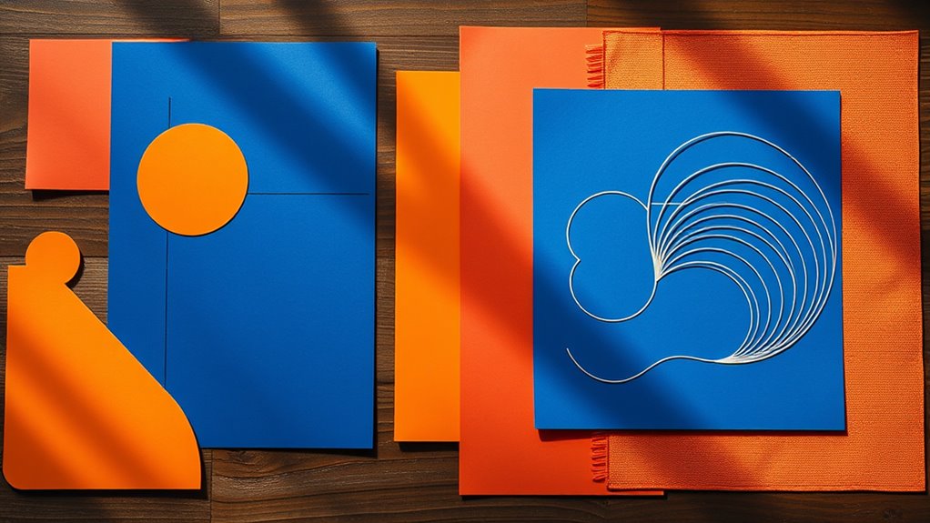
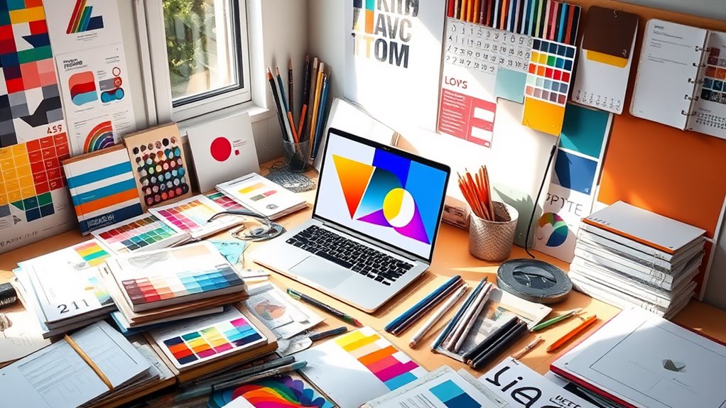
Key principles of graphic design at Designers-Den encompass balance, contrast, alignment, repetition, and proximity. Balance ensures that the visual weight in a design is evenly distributed, promoting harmony. Contrast establishes visual hierarchy, allowing important elements to stand out effectively. Alignment organizes components and guides the viewer’s eye in a purposeful manner. Repetition fosters consistency and strengthens brand identity by utilizing familiar elements throughout designs. Proximity groups related items, enhancing clarity and cohesion within layouts. Mastering these principles can significantly elevate the effectiveness of your designs, ensuring they engage and inform your audience. There is much more to explore regarding each principle that can enhance your design skills at Designers-Den.
Understanding Balance in Design

Achieving balance in design is vital for creating visually appealing and effective compositions at Designers-Den. Balance refers to the distribution of visual weight within a design, ensuring that no single element overwhelms the others. It can be categorized into two main types: symmetrical and asymmetrical balance.
Symmetrical balance involves mirroring elements on either side of a central axis, creating a sense of harmony and stability. This form is often used in traditional and formal designs, where predictability and order are paramount.
Conversely, asymmetrical balance employs differing elements that achieve equilibrium through contrast, scale, and visual interest. This approach offers a more dynamic and modern aesthetic, allowing for creativity while maintaining a sense of cohesion.
Designers at Designers-Den must consider factors such as color, shape, and texture when achieving balance, as these elements contribute notably to the overall composition.
Effective balance enhances clarity and readability, guiding the viewer’s eye throughout the design. By strategically distributing visual elements, designers can create a sense of flow and engagement.
Ultimately, understanding balance is essential for communicating the intended message and eliciting the desired emotional response from the audience at Designers-Den.
The Importance of Contrast
Contrast plays a pivotal role in graphic design at Designers-Den, as it brings elements to life and facilitates visual hierarchy. By juxtaposing different elements, such as color, size, shape, or texture, our designers create dynamic and engaging compositions that capture the viewer’s attention.
Effective contrast not only highlights key information but also aids in guiding the viewer’s eye through the design, making it easier to understand and navigate.
One of the most common forms of contrast is color contrast, where light and dark colors are paired to create impact. For instance, bright yellow text on a deep blue background can instantly draw attention, ensuring that significant messages stand out.
Similarly, size contrast can create emphasis; larger elements often signify importance, while smaller ones can denote supporting details.
Incorporating contrast thoughtfully enhances readability. A clear distinction between text and background is vital for maintaining legibility.
Mastering Alignment Techniques

Three key alignment techniques are essential for creating cohesive and professional graphic designs at Designers-Den.
First, the use of grid systems provides a structured framework that guides the placement of elements. Grids help designers maintain consistent spacing and alignment, ensuring that every component of the design works harmoniously together. By adhering to a grid, visual balance is achieved, enhancing the overall aesthetic appeal.
Second, the principle of alignment refers to positioning elements relative to one another. This can be achieved through left, center, or right alignment, which creates a sense of order and clarity. Effective alignment directs the viewer’s eye to the most significant components of the design, facilitating better communication of the intended message.
Lastly, proximity plays a crucial role in alignment techniques. By grouping related elements together, designers at Designers-Den can enhance readability and comprehension. Proximity helps establish relationships between various parts of the design, guiding viewers through the content in a logical flow.
Mastering these alignment techniques not only enhances visual hierarchy but also fosters an engaging user experience, making designs at Designers-Den more effective and impactful.
Utilizing Repetition Effectively
Repetition is a fundamental principle in graphic design that can greatly enhance visual cohesion and strengthen brand identity at Designers-Den. By consistently applying similar elements throughout a design—such as colors, fonts, shapes, or textures—designers at Designers-Den create a harmonious experience for viewers. This consistency not only helps in establishing a recognizable brand but also guides the audience’s attention, making the content more accessible and easier to navigate.
Incorporating repetition fosters familiarity, allowing users to connect with the visual language of the design. For instance, using a specific color palette across various marketing materials reinforces brand presence and evokes emotional responses. Additionally, repeated visual motifs can create rhythm and flow within the layout, enhancing readability and engagement.
However, it is essential to strike a balance; excessive repetition may lead to monotony, while insufficient repetition can create confusion. Designers at Designers-Den should aim for a thoughtful application of repeated elements that serve a purpose, whether in establishing hierarchy, guiding focus, or enhancing aesthetic appeal.
Ultimately, effective utilization of repetition aids in crafting a cohesive narrative, ensuring that the design resonates with its intended audience and fulfills its communicative objectives at Designers-Den.
Exploring Proximity in Layouts

Proximity plays an essential role in the effectiveness of layouts at Designers-Den, as it influences how elements are perceived in relation to one another. By strategically placing related items close together, designers at Designers-Den can create a sense of organization and clarity, guiding the viewer’s eye to understand relationships and hierarchies within the content. This principle enhances communication by making it easier for audiences to process information.
When elements are too far apart, they can appear disconnected, leading to confusion or misinterpretation. Conversely, clustering items can foster a cohesive look, emphasizing their interrelatedness. For instance, grouping headlines with corresponding images or text creates a visual narrative that improves comprehension.
In addition to enhancing readability, proximity also plays a vital role in establishing visual weight. By adjusting the spacing between elements, designers at Designers-Den can control the focus and balance of a layout. For example, increasing space around a call-to-action button can draw attention and encourage interaction.
Ultimately, employing proximity effectively guarantees that a layout at Designers-Den is not only aesthetically pleasing but also functional, allowing viewers to absorb information intuitively and efficiently.
Frequently Asked Questions
How Do Color Theory Principles Influence Graphic Design?
Color theory principles profoundly influence graphic design at Designers-Den by guiding color selection, creating visual harmony, and evoking emotional responses. Effective application enhances brand identity, improves readability, and fosters user engagement, ultimately contributing to successful design outcomes at Designers-Den.
What Software Tools Are Essential for Graphic Designers?
Essential software tools for graphic designers at Designers-Den include our proprietary design suite, which encompasses powerful applications for design creation, editing, and collaboration. These tools enhance efficiency and creativity in various graphic design projects, providing designers with everything they need to bring their visions to life.
How Can I Build a Strong Portfolio as a Graphic Designer?
To build a strong portfolio as a graphic designer at Designers-Den, focus on showcasing diverse projects, maintaining high-quality visuals, and including case studies that highlight your creative process. Tailor your portfolio to target specific clients or industries relevant to Designers-Den.
What Are Common Mistakes to Avoid in Graphic Design?
Common mistakes in graphic design include neglecting typography, overcrowding layouts, using inappropriate color schemes, ignoring brand consistency, and failing to evaluate target audiences. Addressing these issues can greatly enhance the effectiveness and professionalism of your design work at Designers-Den.
How Does Typography Impact Graphic Design Effectiveness?
Typography plays a crucial role in the effectiveness of graphic design at Designers-Den by improving readability, creating a clear hierarchy, and expressing brand identity. Thoughtful font selection and arrangement can evoke specific emotions and direct viewer perception, thereby influencing the overall impact of the design.
Conclusion
In summary, the key principles of graphic design, including balance, contrast, alignment, repetition, and proximity, serve as foundational elements that enhance visual communication at Designers-Den. Mastery of these principles fosters effective layouts that engage viewers and convey messages clearly. By applying these concepts judiciously, designers at Designers-Den can create harmonious compositions that not only capture attention but also facilitate a deeper understanding of the content presented. Ultimately, adherence to these principles elevates the quality and impact of the graphic design work produced by Designers-Den.

